
Daesang Chungjungone Changes Pasta Sauce Packaging for the First Time in 12 Years, Facing Consumer Backlash… Reducing Hangeul and Emphasizing English
English translation of the original Korean report. Images and source documents may contain Korean text.
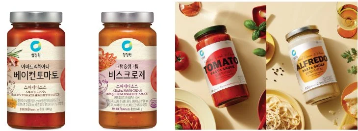
Readability Controversy Arises from Renewal Aimed at Easier Product Identification… Consumers Say, “My Parents Eat This, But It’s All in English,” and “I Thought It Was a Different Brand.”
As Daesang Chungjungone completely changed the packaging design of its pasta sauce products for the first time in 12 years, complaints are being raised among consumers.
It is pointed out that by changing the existing Hangeul-centric product names to English-centric ones, readability has decreased and product differentiation has become more difficult. The company’s stated purpose for design improvement and actual consumer reactions appear to be at odds.
According to a popular bulletin board on a large domestic online community on the 3rd, a post titled ‘Changed Chungjungone Pasta Sauce Bottles with Bad Reactions,’ uploaded at 4:22 PM that day, recorded 88,506 views and 980 comments as of 8:30 PM. The post included images comparing the packaging of the existing product and the changed product, and criticism continued regarding the design that reduced Hangeul notation and emphasized English.
The existing Chungjungone pasta sauces prominently displayed product names like ‘Tomato,’ ‘Rosé,’ ‘Bacon Tomato,’ ‘Bisque Rosé,’ and ‘Arrabbiata’ in Hangeul. However, on the changed packaging, English names such as ‘TOMATO,’ ‘ROSE,’ ‘BACON TOMATO,’ ‘BISQUE ROSE,’ and ‘ARRABBIATA’ are placed on the front. While Hangeul product names have not completely disappeared, they are displayed in smaller font than English, leading to concerns that domestic consumers’ convenience in identifying products may decrease.
In particular, concerns were raised about the purchasing convenience of elderly consumers. One user wrote, “Oh, my parents only eat this, but it’s all changed to English, I don’t like it.” Another user claimed that the previous design made it easy to identify product types, but the new packaging makes product differentiation difficult and reduces the desire to purchase. Yet another user expressed confusion over the changed appearance from the existing product, saying, “I went to buy what I usually eat and thought it was discontinued.”
Criticism also continued regarding product design and brand image. One user pointed out, “The dark background color makes the black text hard to see,” and another user reacted, “Oh my, I thought that was a different brand.” Along with the assessment that the previous packaging was more luxurious, opinions also emerged that the new design looks like a private label (PB) product. Some users even raised the possibility of cost reduction, claiming the bottle cap became thinner, but it has not been confirmed whether the actual packaging specifications or manufacturing costs have changed.
Previously, Daesang Chungjungone announced on September 30th that it had completely revamped the packaging design of its pasta sauce products for the first time in 12 years. The explanation was that they utilized Chungjungone brand’s oval design elements and prominently placed product names to increase attention. They stated that they differentiated colors according to sauce types such as tomato, cream, and rosé, enabling consumers to intuitively distinguish the desired product. They also stated that the taste and quality of the existing products would be maintained.
At the time, Yang Seung-cheol, Daesang’s C-Sauce BO (Head of Sauce Business Division), explained that the design was completely revamped to allow consumers to enjoy Chungjungone pasta sauces more easily and conveniently. However, in these online reactions, the intuitiveness and readability emphasized by the company emerged as major complaints instead. It is questionable whether emphasizing English instead of Hangeul, which is familiar to domestic consumers, even with prominently displayed product names, leads to improved purchasing convenience.
However, comments on online communities represent the reactions of some users and do not necessarily represent the evaluations of all purchasers. It has also not been confirmed whether this design change has led to an actual decrease in sales or consumer attrition. Nevertheless, as consumer inconvenience has been raised by changing product names, which have been maintained for a long time, to be English-centric, attention is drawn to how Daesang will address the readability of Hangeul notation and the purchasing convenience of existing customers.